Show
<ShowButton> uses Ant Design's <Button> component. It uses the show method from useNavigation under the hood. It can be useful when redirecting the app to the show page with the record id route of resource.
You can swizzle this component to customize it with the refine CLI
Usage
import {
    List,
    Table,
    useTable,
    ShowButton,
} from "@pankod/refine-antd";

export const PostList: React.FC = () => {
    const { tableProps } = useTable<IPost>();

    return (
        <List>
            <Table {...tableProps} rowKey="id">
                <Table.Column dataIndex="id" title="ID" />
                <Table.Column dataIndex="title" title="Title" />
                <Table.Column<IPost>
                    title="Actions"
                    dataIndex="actions"
                    render={(_, record) => (
                        <ShowButton size="small" recordItemId={record.id} />
                    )}
                />
            </Table>
        </List>
    );
};

interface IPost {
    id: number;
    title: string;
}
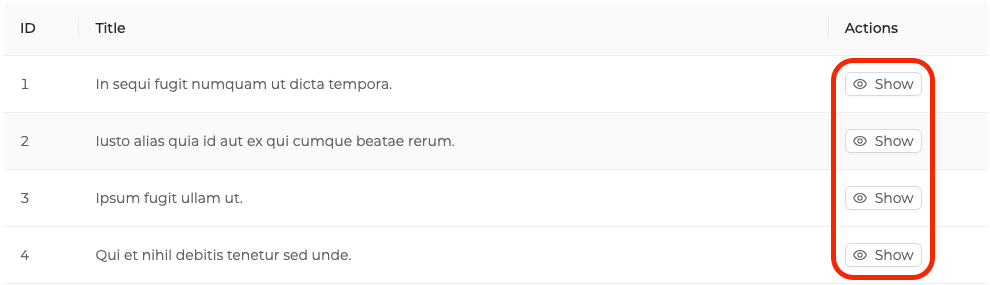
Will look like this:
Properties
recordItemId
recordItemId is used to append the record id to the end of the route path.
import { ShowButton } from "@pankod/refine-antd";

export const MyShowComponent = () => {
    return <ShowButton resourceName="posts" recordItemId="1" />;
};
Clicking the button will trigger the show method of useNavigation and then redirect the app to /posts/show/1.
<ShowButton> component reads the id information from the route by default.
resourceNameOrRouteName
Redirection endpoint(resourceNameOrRouteName/show) is defined by resourceNameOrRouteName property. By default, <ShowButton> uses name property of the resource object as an endpoint to redirect after clicking.
import { ShowButton } from "@pankod/refine-antd";

export const MyShowComponent = () => {
    return <ShowButton resourceNameOrRouteName="categories" recordItemId="2" />;
};
Clicking the button will trigger the show method of useNavigation and then redirect the app to /categories/show/2.
hideText
It is used to show and not show the text of the button. When true, only the button icon is visible.
import { ShowButton } from "@pankod/refine-antd";

export const MyShowComponent = () => {
    return <ShowButton hideText />;
};
accessControl
This prop can be used to skip access control check with its enabled property or to hide the button when the user does not have the permission to access the resource with hideIfUnauthorized property. This is relevant only when an accessControlProvider is provided to <Refine/>
import { ShowButton } from "@pankod/refine-antd";

export const MyListComponent = () => {
    return <ShowButton accessControl={{ enabled: true, hideIfUnauthorized: true }} />;
};
API Reference
Properties
It also accepts all props of Ant Design Button.