Swizzle Ready
Import
<ImportButton> is compatible with the useImport hook and is meant to be used as it's upload button.
It uses Ant Design's <Button> and <Upload> components. It wraps a <Button> component with an <Upload> component and accepts properties for <Button> and <Upload> components separately.
Swizzle
You can swizzle this component to customize it with the refine CLI
Usage
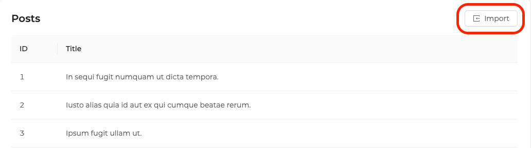
/src/pages/posts/list.tsx
import {
    List,
    Table,
    useTable,
    useImport,
    ImportButton,
} from "@pankod/refine-antd";

export const PostList: React.FC = () => {
    const { tableProps } = useTable<IPost>();

    const importProps = useImport<IPostFile>();

    return (
        <List
            pageHeaderProps={{
                extra: <ImportButton {...importProps} />,
            }}
        >
            <Table {...tableProps} rowKey="id">
                <Table.Column dataIndex="id" title="ID" />
                <Table.Column dataIndex="title" title="Title" />
            </Table>
        </List>
    );
};

interface IPost {
    id: number;
    title: string;
}

interface IPostFile {
    title: string;
    categoryId: number;
}
Will look like this:
Properties
hideText
It is used to show and not show the text of the button. When true, only the button icon is visible.
import { ImportButton, useImport } from "@pankod/refine-antd";

export const MyImportComponent = () => {
    const importProps = useImport();

    return <ImportButton {...importProps} hideText />;
};