Delete
<DeleteButton> uses Material UI <LoadingButton> and <Dialog> components.
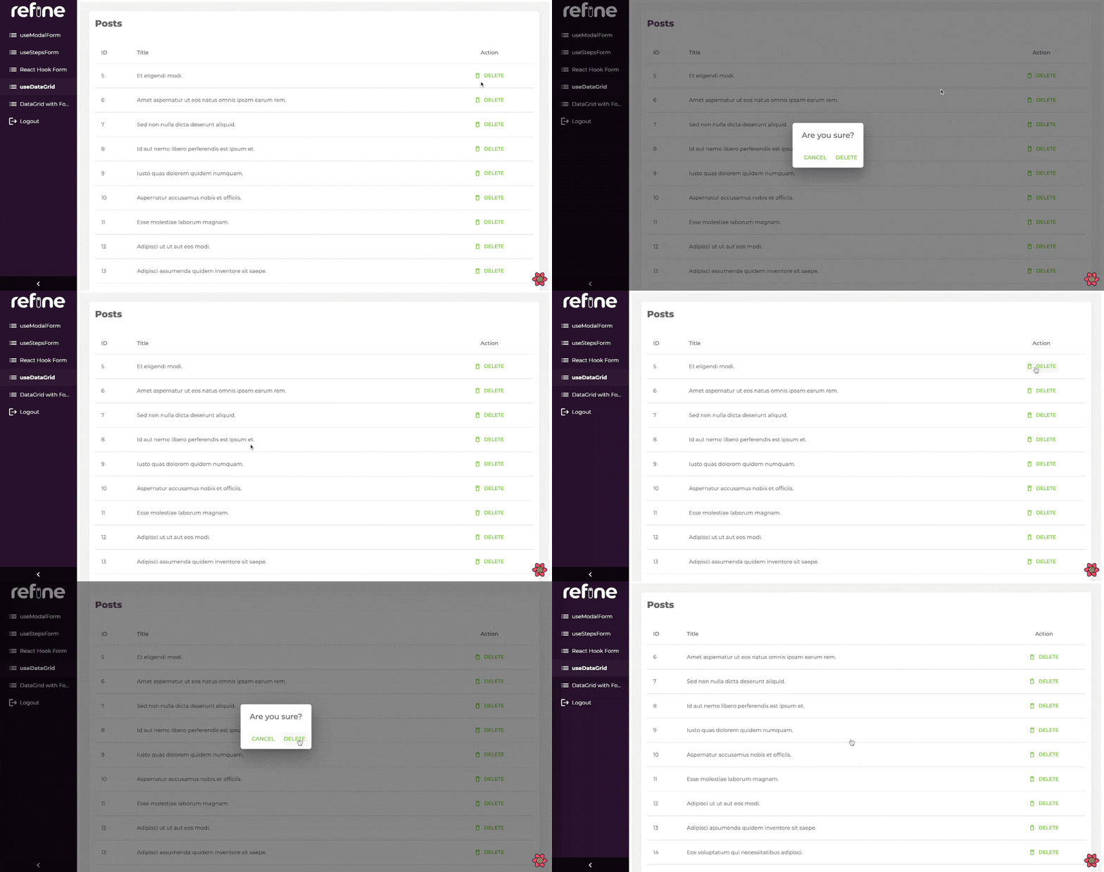
When you try to delete something, a pop-up shows up and asks for confirmation. When confirmed it executes the useDelete method provided by your dataProvider.
You can swizzle this component to customize it with the refine CLI
Usage
import { useTable } from "@pankod/refine-core";

import {
    List,
    Table,
    DeleteButton,
    TableHead,ev
    TableRow,
    TableCell,
    TableBody,
} from "@pankod/refine-mui";

export const PostList: React.FC = () => {
    const { tableQueryResult } = useTable<IPost>();

    const { data } = tableQueryResult;

    return (
        <List>
            <Table aria-label="simple table">
                <TableHead>
                    <TableRow>
                        <TableCell>ID</TableCell>
                        <TableCell>Title</TableCell>
                        <TableCell align="center">Action</TableCell>
                    </TableRow>
                </TableHead>
                <TableBody>
                    {data?.data.map((row) => (
                        <TableRow key={row.id}>
                            <TableCell>{row.id}</TableCell>
                            <TableCell component="th" scope="row">
                                {row.title}
                            </TableCell>
                            <TableCell align="center">
                                <DeleteButton
                                    recordItemId={row.id}
                                />
                            </TableCell>
                        </TableRow>
                    ))}
                </TableBody>
            </Table>
        </List>
    );
};

interface IPost {
    id: number;
    title: string;
}
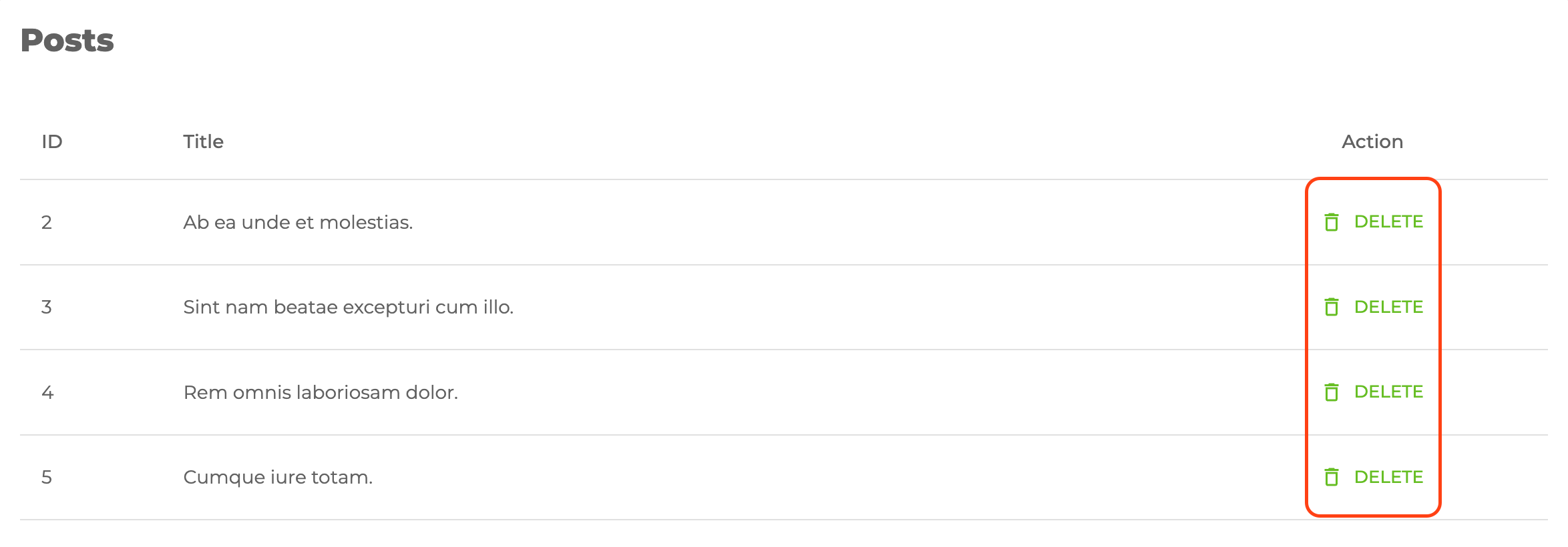
Will look like this:

When clicked, it opens the confirmation window like this:

Properties
recordItemId
recordItemId allows us to manage which record will be deleted.
import { DeleteButton } from "@pankod/refine-mui";

export const MyDeleteComponent = () => {
    return <DeleteButton resourceNameOrRouteName="posts" recordItemId="1" />;
};
Clicking the button will trigger the useDelete method and then the record whose resource is post and whose id is 1 gets deleted.
<DeleteButton> component reads the id information from the route by default.
onSuccess
onSuccess can be used if you want to do anything on the result returned after the delete request.
For example, let's console.log after deletion:
import { useTable } from "@pankod/refine-core";

import {
    List,
    Table,
    DeleteButton,
    TableHead,
    TableRow,
    TableCell,
    TableBody,
} from "@pankod/refine-mui";

export const PostList: React.FC = () => {
    const { tableQueryResult } = useTable<IPost>();

    const { data } = tableQueryResult;

    return (
        <List>
            <Table aria-label="simple table">
                <TableHead>
                    <TableRow>
                        <TableCell>ID</TableCell>
                        <TableCell>Title</TableCell>
                        <TableCell align="center">Action</TableCell>
                    </TableRow>
                </TableHead>
                <TableBody>
                    {data?.data.map((row) => (
                        <TableRow key={row.id}>
                            <TableCell>{row.id}</TableCell>
                            <TableCell component="th" scope="row">
                                {row.title}
                            </TableCell>
                            <TableCell align="center">
                                <DeleteButton
                                    recordItemId={record.id}
                                    onSuccess={(value) => {
                                        console.log(value);
                                    }}
                                />
                            </TableCell>
                        </TableRow>
                    ))}
                </TableBody>
            </Table>
        </List>
    );
};

interface IPost {
    id: number;
    title: string;
}
mutationMode
Determines which mode mutation will have while executing <DeleteButton>.
Refer to the mutation mode docs for further information. →
import { useTable } from "@pankod/refine-core";

import {
    List,
    Table,
    DeleteButton,
    TableHead,
    TableRow,
    TableCell,
    TableBody,
} from "@pankod/refine-mui";

export const PostList: React.FC = () => {
    const { tableQueryResult } = useTable<IPost>();

    const { data } = tableQueryResult;

    return (
        <List>
            <Table aria-label="simple table">
                <TableHead>
                    <TableRow>
                        <TableCell>ID</TableCell>
                        <TableCell>Title</TableCell>
                        <TableCell align="center">Action</TableCell>
                    </TableRow>
                </TableHead>
                <TableBody>
                    {data?.data.map((row) => (
                        <TableRow key={row.id}>
                            <TableCell>{row.id}</TableCell>
                            <TableCell component="th" scope="row">
                                {row.title}
                            </TableCell>
                            <TableCell align="center">
                                <DeleteButton
                                    recordItemId={row.id}
                                    mutationMode="undoable"
                                />
                            </TableCell>
                        </TableRow>
                    ))}
                </TableBody>
            </Table>
        </List>
    );
};

interface IPost {
    id: number;
    title: string;
}
hideText
It is used to show and not show the text of the button. When true, only the button icon is visible.
import { DeleteButton } from "@pankod/refine-mui";

export const MyDeleteComponent = () => {
    return <DeleteButton hideText />;
};
accessControl
This prop can be used to skip access control check with its enabled property or to hide the button when the user does not have the permission to access the resource with hideIfUnauthorized property. This is relevant only when an accessControlProvider is provided to <Refine/>
import { DeleteButton } from "@pankod/refine-mui";

export const MyListComponent = () => {
    return <DeleteButton accessControl={{ enabled: true, hideIfUnauthorized: true }} />;
};
How to override confirm texts?
You can change the text that appears when you confirm a transaction with confirmTitle prop, as well as what ok and cancel buttons text look like with confirmOkText and confirmCancelText props.
import { DeleteButton } from "@pankod/refine-mui";

export const MyDeleteComponent = () => {
    return (
        <DeleteButton
            confirmTitle="Title"
            confirmOkText="Ok Text"
            confirmCancelText="Delete Text"
        />
    );
};
API Reference
Props
It also accepts all props of Material UI Button.