Your First Headless App using Tailwind.css
Introduction
This tutorial will go through a standard process of building a simple admin panel for a CMS-like application using refine's headless core combined with TailwindCSS.
Step by step, you're going to learn how to consume a REST API and add basic CRUD functionality to your panel leveraging the unique capabilities of refine.
Let's begin by setting up a new refine project.
Setting up
There are two alternative methods to set up a refine application.
The recommended way is using the create refine-app tool. create refine-app's CLI wizard will let you create and customize your application in seconds.
Alternatively, you may use the create-react-app tool to create an empty React application and then add refine module via npm.
- use create refine-app
- use create-react-app
First, run the create-react-app tool to bootstrap an empty React project.
npx create-react-app tutorial --template typescript
--template typescript flag will ensure that the Typescript language is selected.
Navigate to the project folder and install refine with the following npm command:
- use npm
- use yarn
npm i @pankod/refine-core @pankod/refine-react-router-v6
yarn add @pankod/refine-core @pankod/refine-react-router-v6
:::warning
This tutorial assumes your project is configured for absolute imports. Since CRA does not configure it by default, you should configure it yourself to be able to use absolute imports. You should configure a tsconfig.json with baseUrl setting pointing to the /src directory in your project.
Refer to CRA docs for more information about absolute imports. → :::
First, run the create refine-app with the following command:
npm create refine-app -o refine-headless tutorial
About Fake REST API
refine is designed to consume data from APIs.
For the sake of this tutorial, we will provide you a fully working, fake REST API located at https://api.fake-rest.refine.dev/. You may take a look at available resources and routes of the API before proceeding to the next step.
Using a Dataprovider
Dataproviders are refine components making it possible to consume different API's and data services conveniently. To consume our Fake REST API, we'll use the "Simple REST Dataprovider".
Next, navigate to the project folder and run the following command to install the required package:
- use npm
- use yarn
npm i @pankod/refine-simple-rest
yarn add @pankod/refine-simple-rest
If you used create refine-app to bootstrap the project, you can skip issuing this command as create refine-app already installs the selected data provider.
Fake REST API is based on JSON Server Project. Simple REST Dataprovider is fully compatible with the REST rules and methods of the JSON Server.
refine includes many out-of-the-box data providers to use in your projects like:
- Simple REST API
- GraphQL
- NestJS CRUD
- Airtable
- Strapi - Strapi v4
- Strapi GraphQL
- Supabase
- Hasura
- Nhost
- Appwrite
- Medusa
- Altogic
Community ❤️
Refer to the dataProvider documentation for detailed usage. →
Bootstrapping the Application
If you don't use create refine-app, replace the contents of App.tsx with the following code:
import { Refine } from "@pankod/refine-core";
import routerProvider from "@pankod/refine-react-router-v6";
import dataProvider from "@pankod/refine-simple-rest";

const App: React.FC = () => {
    return (
        <Refine
            routerProvider={routerProvider}
            dataProvider={dataProvider("https://api.fake-rest.refine.dev")}
        />
    );
};

export default App;
<Refine/> is the root component of a refine application. Using the dataProvider prop, we made our Simple REST Dataprovider available to the entire application.
Run the following command to launch the app in development mode:
- with create refine-app
- with create-react-app
npm run dev
npm run start
Your refine application should be up and running! Point your browser to http://localhost:3000 to access it. You will see the welcome page.
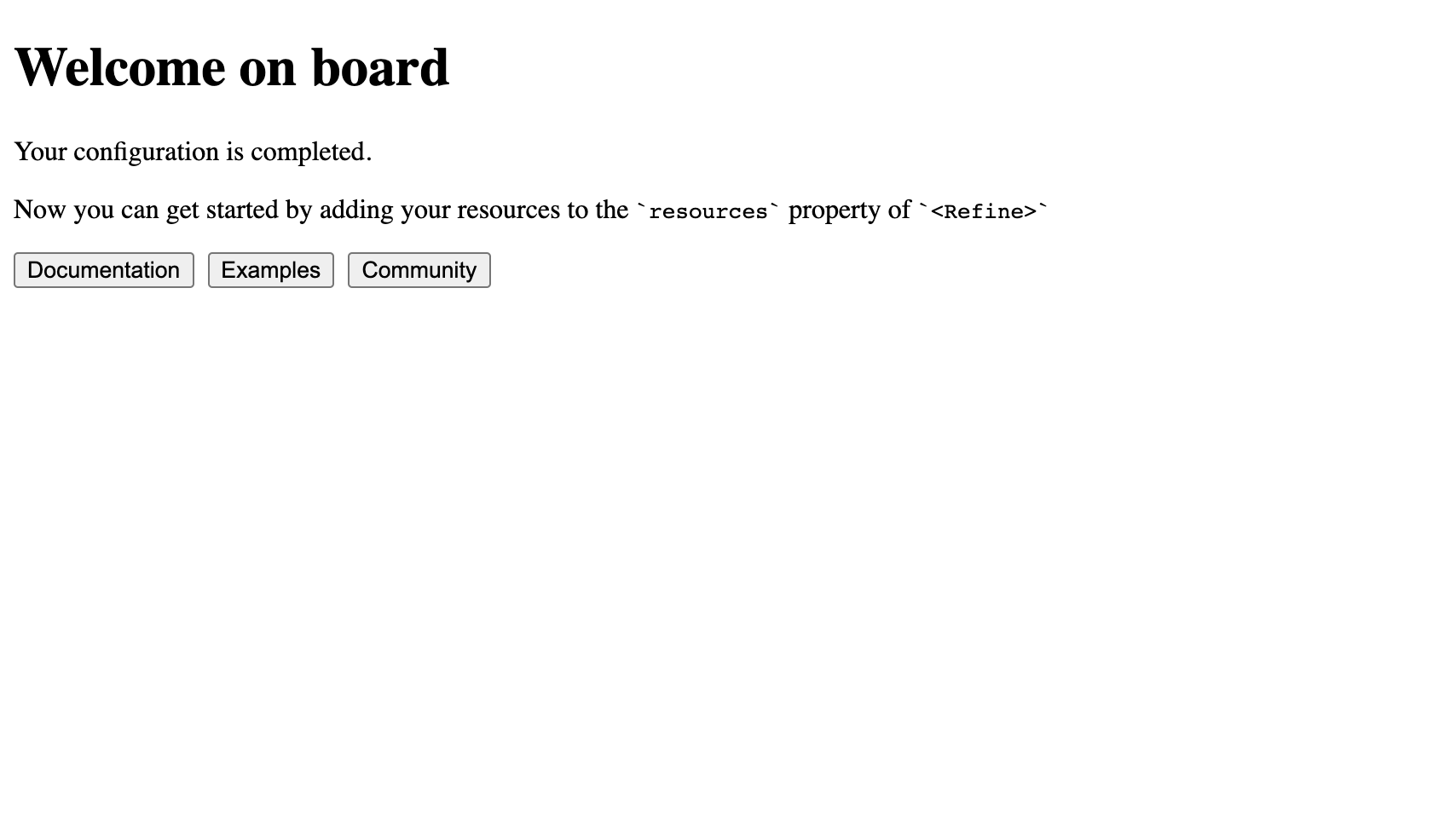
The ready page is displayed when there are no resources in the refine app. You can change it with the ReadyPage prop.
Adding Resources
Now we are ready to start connecting to our API by adding a resource to our application.
Let's add /posts/ endpoint from our API as a resource. First take a look to the raw API response for the request made to the /posts/ route:
Show response
[
  {
    "id": 1,
    "title": "Eius ea autem sapiente placeat fuga voluptas quos quae.",
    "slug": "beatae-esse-dolor",
    "content": "Explicabo nihil delectus. Nam aliquid sunt numquam...",
    "category": {
      "id": 24
    },
    "user": {
      "id": 7
    },
    "status": "draft",
    "createdAt": "2021-03-13T03:09:30.186Z",
    "image": [],
    "tags": [
      7,
      4
    ],
    "language": 2
  },
  ...
]
Now, add the highlighted code to your App.tsx to connect to the endpoint.
import { Refine } from "@pankod/refine-core";
import routerProvider from "@pankod/refine-react-router-v6";
import dataProvider from "@pankod/refine-simple-rest";

import { PostIcon } from "icons";

export const App: React.FC = () => {
    return (
        <Refine
            routerProvider={routerProvider}
            dataProvider={dataProvider("https://api.fake-rest.refine.dev")}
            resources={[{ name: "posts", icon: PostIcon }]}
        />
    );
};
The icon property of every single resource is can be used to display the resource in whatever way you want. For example in the sidebar or header. We'll use it when we'll create layout component.
Show PostIconIf you want to show the icon for your posts resource; you need to create an icons.ts file at src folder and add the following code to it. Its fully optional and you can just comment out the import and the icon property if you want to.
posts resource; you need to create an icons.ts file at src folder and add the following code to it. Its fully optional and you can just comment out the import and the icon property if you want to.export const PostIcon = (
<svg
xmlns="http://www.w3.org/2000/svg"
width="20"
height="20"
viewBox="0 0 24 24"
fill="none"
stroke="currentColor"
strokeWidth="2"
strokeLinecap="round"
strokeLinejoin="round"
>
<polygon points="12 2 2 7 12 12 22 7 12 2"></polygon>
<polyline points="2 17 12 22 22 17"></polyline>
<polyline points="2 12 12 17 22 12"></polyline>
</svg>
);
resources is a property of <Refine/> representing API Endpoints. The name property of every single resource should match one of the endpoints in your API!
Instead of showing the welcome page, the application should redirect now to an URL defined by the name property. Open your application to check that the URL is routed to /posts:
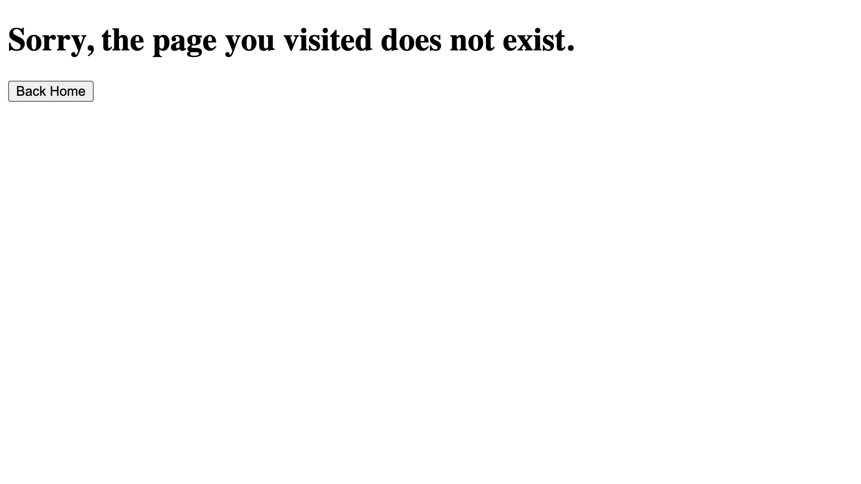
You can change the 404 error page with the catchAll prop.
You'll still see a 404 error page because no Page component is assigned to our resource yet.
resources use Page components to handle data and perform rendering. Page components are passed to resources as an array of objects.
For basic CRUD operations, there are four predefined props: list, create, edit and show.
Let's create a Page component to fetch posts and display them as a table. Later, we will pass the component as the list prop to our resource.
Adding Tailwind CSS
We will use Tailwind for the UI of the example app. You can prefer any UI library or design system since it's not affecting the usability.
Install tailwindcss and its peer dependencies via npm, and then run the init command to generate both tailwind.config.js and postcss.config.js.
npm i -D tailwindcss postcss autoprefixer
npx tailwindcss init
Add the paths to all of your template files in your tailwind.config.js file.
module.exports = {
    content: ["./src/**/*.{js,jsx,ts,tsx}"],
    theme: {
        extend: {},
    },
    plugins: [],
};
Add the @tailwind directives for each of Tailwind’s layers to your src/index.css file.
@tailwind base;
@tailwind components;
@tailwind utilities;
Add css file import to src/App.tsx.
...

import 'index.css';
Now, you can use Tailwind to style your application.
Creating a Layout
We will create a Layout component to handle the rendering of the Page components.
Create a new folder named "components" under "/src" and create a new file named "Layout.tsx" with the following code:
import { useMenu, useNavigation, LayoutProps } from "@pankod/refine-core";
import routerProvider from "@pankod/refine-react-router-v6";

const { Link } = routerProvider;

export const Layout: React.FC<LayoutProps> = ({ children }) => {
    const { menuItems } = useMenu();
    const { push } = useNavigation();

    return (
        <div className="flex min-h-screen flex-col">
            <div className="mb-2 border-b py-2">
                <div className="container mx-auto">
                    <div className="flex items-center gap-2">
                        <Link to="/">
                            <img
                                className="w-32"
                                src="https://refine.dev/img/refine_logo.png"
                                alt="Logo"
                            />
                        </Link>
                        <ul>
                            {menuItems.map(({ name, label, icon, route }) => (
                                <li key={name} className="float-left">
                                    <a
                                        className="flex cursor-pointer items-center gap-1 rounded-sm px-2 py-1 capitalize decoration-indigo-500 decoration-2 underline-offset-1 transition duration-300 ease-in-out hover:underline"
                                        onClick={() => push(route || "")}
                                    >
                                        {icon}
                                        <span>{label ?? name}</span>
                                    </a>
                                </li>
                            ))}
                        </ul>
                    </div>
                </div>
            </div>
            <div className="bg-white">{children}</div>
        </div>
    );
};
We created a header with a logo and a list of links to all menu items (resources). The links are clickable and will navigate to the corresponding resource. To do this, we used the useMenu hook to get the menu items from the <Refine/> and the useNavigation hook to used to navigate between resources.
children is the content of the layout. In our case, it is the content of the Page components.
Now, we can use the <Layout> in our application.
import { Refine } from "@pankod/refine-core";
import routerProvider from "@pankod/refine-react-router-v6";
import dataProvider from "@pankod/refine-simple-rest";

import { Layout } from "components/Layout";
import { PostIcon } from "icons";

export const App: React.FC = () => {
    return (
        <Refine
            routerProvider={routerProvider}
            dataProvider={dataProvider("https://api.fake-rest.refine.dev")}
            resources={[{ name: "posts", icon: PostIcon }]}
            Layout={Layout}
        />
    );
};
Creating a List Page
First, we'll install @pankod/refine-react-table package to use the useTable hook, which extended with TanStack Table v8.
npm i @pankod/refine-react-table
We'll use the @pankod/refine-react-table for benefit of the TanStack Table v8 library. However, you can use useTable without the @pankod/refine-react-table package.
Next, we'll need an interface to work with the data from the API endpoint.
Create a new folder named "interfaces" under "/src" if you don't already have one. Then create a "index.d.ts" file with the following code:
export interface IPost {
    id: number;
    title: string;
    status: "published" | "draft" | "rejected";
    createdAt: string;
}
We'll be using id, title, status and createdAt fields of every post record.
Now, create a new folder named "pages/posts" under "/src". Under that folder, create a "list.tsx" file with the following code:
import React from "react";
import { useTable, ColumnDef, flexRender } from "@pankod/refine-react-table";

import { IPost } from "interfaces";

export const PostList: React.FC = () => {
    const columns = React.useMemo<ColumnDef<IPost>[]>(
        () => [
            {
                id: "id",
                header: "ID",
                accessorKey: "id",
            },
            {
                id: "title",
                header: "Title",
                accessorKey: "title",
            },
            {
                id: "status",
                header: "Status",
                accessorKey: "status",
            },
            {
                id: "createdAt",
                header: "CreatedAt",
                accessorKey: "createdAt",
            },
        ],
        [],
    );

    const { getHeaderGroups, getRowModel } = useTable<IPost>({
        columns,
    });

    return (
        <div className="container mx-auto pb-4">
            <table className="min-w-full table-fixed divide-y divide-gray-200 border">
                <thead className="bg-gray-100">
                    {getHeaderGroups().map((headerGroup) => (
                        <tr key={headerGroup.id}>
                            {headerGroup.headers.map((header) => (
                                <th
                                    key={header.id}
                                    colSpan={header.colSpan}
                                    className="py-3 px-6 text-left text-xs font-medium uppercase tracking-wider text-gray-700 "
                                >
                                    {flexRender(
                                        header.column.columnDef.header,
                                        header.getContext(),
                                    )}
                                </th>
                            ))}
                        </tr>
                    ))}
                </thead>
                <tbody className="divide-y divide-gray-200 bg-white">
                    {getRowModel().rows.map((row) => {
                        return (
                            <tr
                                key={row.id}
                                className="transition hover:bg-gray-100"
                            >
                                {row.getVisibleCells().map((cell) => {
                                    return (
                                        <td
                                            key={cell.id}
                                            className="whitespace-nowrap py-2 px-6 text-sm font-medium text-gray-900"
                                        >
                                            {flexRender(
                                                cell.column.columnDef.cell,
                                                cell.getContext(),
                                            )}
                                        </td>
                                    );
                                })}
                            </tr>
                        );
                    })}
                </tbody>
            </table>
        </div>
    );
};
@pankod/refine-react-table hook uses useTable() fetches data from API. Normally, TanStack-table's useReactTable expects a data prop but @pankod/refine-react-table's useTable doesn't expect a data prop.
Refer to the @pankod/refine-react-table for more information. →
Finally, we are ready to add <PostList> to our resource. Add the highlighted line to your App.tsx
import { Refine } from "@pankod/refine-core";
import routerProvider from "@pankod/refine-react-router-v6";
import dataProvider from "@pankod/refine-simple-rest";

import { PostList } from "pages/posts";
import { Layout } from "components/Layout";
import { PostIcon } from "/icons";

export const App: React.FC = () => {
    return (
        <Refine
            routerProvider={routerProvider}
            dataProvider={dataProvider("https://api.fake-rest.refine.dev")}
            resources={[{ name: "posts", icon: PostIcon, list: PostList }]}
            Layout={Layout}
        />
    );
};

<br />;
Note you will need a few more files which help src/App.tsx to find your pages and posts. In the /pages folder, put this index.tsx file in it which allows everything in the posts folder to be used elsewhere.
export * from "./posts";
Similarly, put a file in the /src/pages/posts folder which accomplishes the same function. We will use the commented out code later as we add more capabilities to our app. Remember as you add functions, uncomment each appropriate line.
export * from "./list";
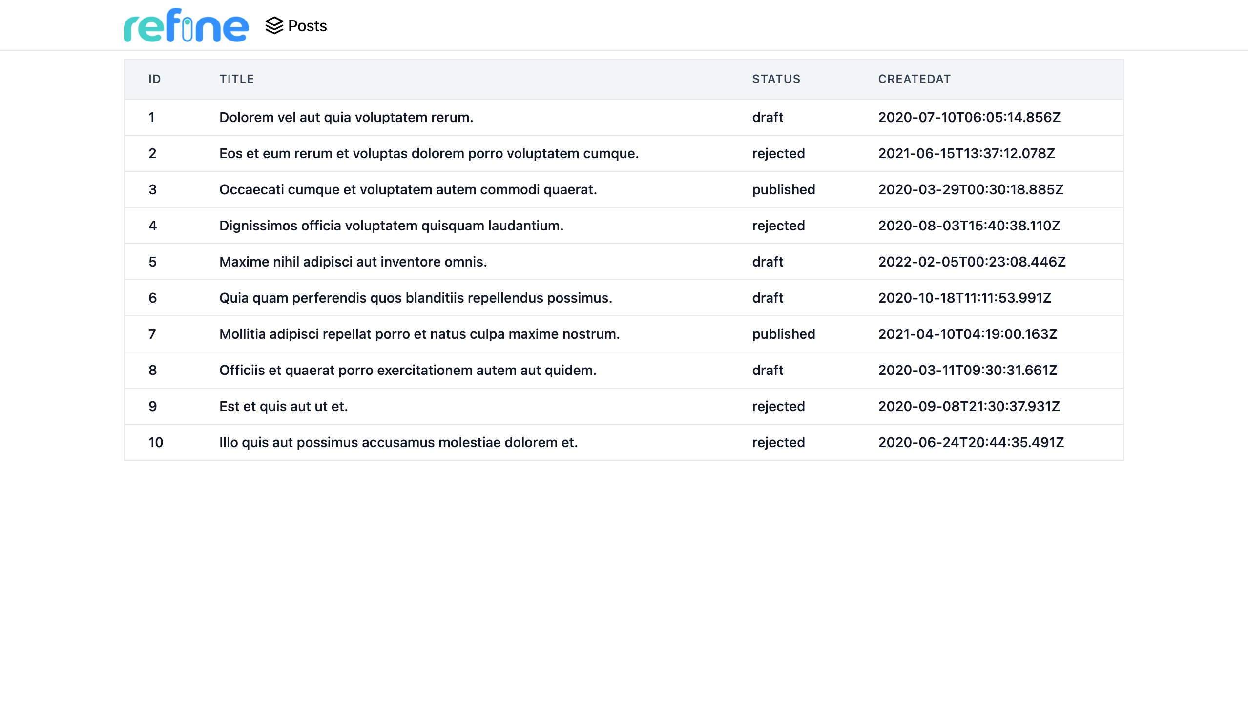
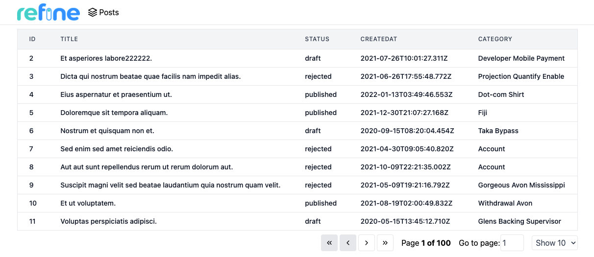
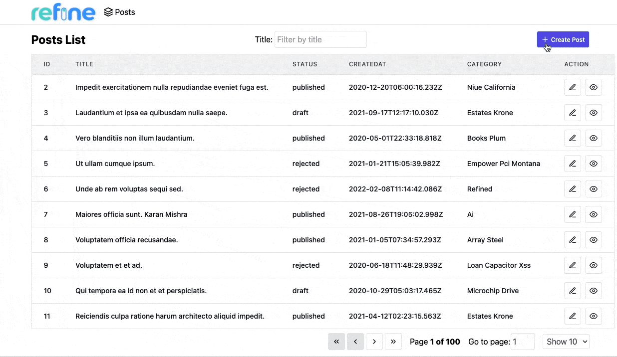
Open your application in your browser. You will see posts are displayed correctly in a table structure.
On the next step, we are going to add a category field to the table which involves handling data relationships.
Handling relationships
Remember the records from /posts endpoint has a category id field.
...
  "category": {
    "id": 26
  }
...
To display category titles on our table, we first need to map category id's to their corresponding titles.
The category title data can be obtained from the /categories endpoint for each record.
  {
    "id": 26,
    "title": "mock category title",
  }
At this point, we need to join records from different resources. For this, we're going to use the refine hook useMany.
Before we start, just edit our interface for the new ICategory type:
export interface ICategory {
    id: number;
    title: string;
}

export interface IPost {
    id: number;
    title: string;
    status: "published" | "draft" | "rejected";
    createdAt: string;
    category: { id: number };
}
So we can update our list.tsx with the highlighted lines:
import React from "react";
import { useTable, ColumnDef, flexRender } from "@pankod/refine-react-table";
import { useMany, GetManyResponse } from "@pankod/refine-core";

import { IPost, ICategory } from "interfaces";

export const PostList: React.FC = () => {
    const columns = React.useMemo<ColumnDef<IPost>[]>(
        () => [
            {
                id: "id",
                header: "ID",
                accessorKey: "id",
            },
            {
                id: "title",
                header: "Title",
                accessorKey: "title",
            },
            {
                id: "status",
                header: "Status",
                accessorKey: "status",
            },
            {
                id: "createdAt",
                header: "CreatedAt",
                accessorKey: "createdAt",
            },
            {
                id: "category.id",
                header: "Category",
                accessorKey: "category.id",
                cell: function render({ getValue, table }) {
                    const meta = table.options.meta as {
                        categoriesData: GetManyResponse<ICategory>;
                    };
                    const category = meta.categoriesData?.data.find(
                        (item) => item.id === getValue(),
                    );
                    return category?.title ?? "Loading...";
                },
            },
        ],
        [],
    );

    const {
        getHeaderGroups,
        getRowModel,
        setOptions,
        refineCore: {
            tableQueryResult: { data: tableData },
        },
    } = useTable<IPost>({ columns });

    const categoryIds = tableData?.data?.map((item) => item.category.id) ?? [];
    const { data: categoriesData } = useMany<ICategory>({
        resource: "categories",
        ids: categoryIds,
        queryOptions: {
            enabled: categoryIds.length > 0,
        },
    });

    setOptions((prev) => ({
        ...prev,
        meta: {
            ...prev.meta,
            categoriesData,
        },
    }));

    return (
        <div className="container mx-auto pb-4">
            <table className="min-w-full table-fixed divide-y divide-gray-200 border">
                <thead className="bg-gray-100">
                    {getHeaderGroups().map((headerGroup) => (
                        <tr key={headerGroup.id}>
                            {headerGroup.headers.map((header) => (
                                <th
                                    key={header.id}
                                    colSpan={header.colSpan}
                                    className="py-3 px-6 text-left text-xs font-medium uppercase tracking-wider text-gray-700 "
                                >
                                    {flexRender(
                                        header.column.columnDef.header,
                                        header.getContext(),
                                    )}
                                </th>
                            ))}
                        </tr>
                    ))}
                </thead>
                <tbody className="divide-y divide-gray-200 bg-white">
                    {getRowModel().rows.map((row) => {
                        return (
                            <tr
                                key={row.id}
                                className="transition hover:bg-gray-100"
                            >
                                {row.getVisibleCells().map((cell) => {
                                    return (
                                        <td
                                            key={cell.id}
                                            className="whitespace-nowrap py-2 px-6 text-sm font-medium text-gray-900"
                                        >
                                            {flexRender(
                                                cell.column.columnDef.cell,
                                                cell.getContext(),
                                            )}
                                        </td>
                                    );
                                })}
                            </tr>
                        );
                    })}
                </tbody>
            </table>
        </div>
    );
};
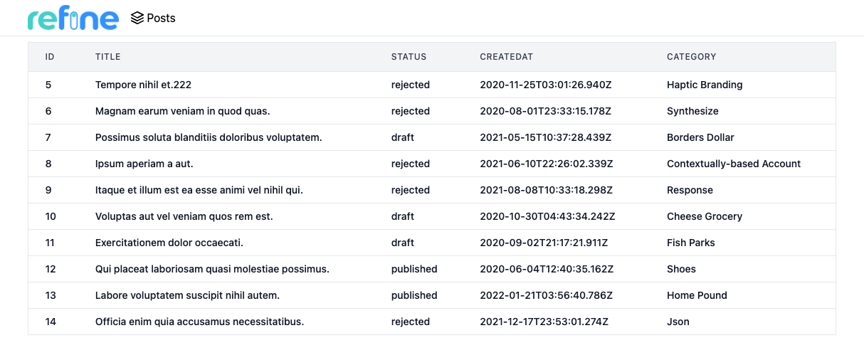
Try the result on your browser and you'll notice that the category column is filled correctly with the matching category titles for the each record's category id's.
Refer to the useMany documentation for detailed usage information. →
Adding Pagination
The @pankod/refine-react-table package listens for changes in pageIndex and pageSize states of the Tanstack Table and updates the table accordingly. The change in these states triggers the fetch of the new data.
import React from "react";
import { useTable, ColumnDef, flexRender } from "@pankod/refine-react-table";
import { useMany, GetManyResponse } from "@pankod/refine-core";

import {
    ChevronLeftIcon,
    ChevronRightIcon,
    ChevronsLeftIcon,
    ChevronsRightIcon,
} from "icons";

import { IPost, ICategory } from "interfaces";

export const PostList: React.FC = () => {
    const columns = React.useMemo<ColumnDef<IPost>[]>(
        () => [
            {
                id: "id",
                header: "ID",
                accessorKey: "id",
            },
            {
                id: "title",
                header: "Title",
                accessorKey: "title",
            },
            {
                id: "status",
                header: "Status",
                accessorKey: "status",
            },
            {
                id: "createdAt",
                header: "CreatedAt",
                accessorKey: "createdAt",
            },
            {
                id: "category.id",
                header: "Category",
                accessorKey: "category.id",
                cell: function render({ getValue, table }) {
                    const meta = table.options.meta as {
                        categoriesData: GetManyResponse<ICategory>;
                    };
                    const category = meta.categoriesData?.data.find(
                        (item) => item.id === getValue(),
                    );
                    return category?.title ?? "Loading...";
                },
            },
        ],
        [],
    );

    const {
        getState,
        setPageIndex,
        getCanPreviousPage,
        getPageCount,
        getCanNextPage,
        nextPage,
        previousPage,
        setPageSize,
        getHeaderGroups,
        getRowModel,
        setOptions,
        refineCore: {
            tableQueryResult: { data: tableData },
        },
    } = useTable<IPost>({ columns });

    const categoryIds = tableData?.data?.map((item) => item.category.id) ?? [];
    const { data: categoriesData } = useMany<ICategory>({
        resource: "categories",
        ids: categoryIds,
        queryOptions: {
            enabled: categoryIds.length > 0,
        },
    });

    setOptions((prev) => ({
        ...prev,
        meta: {
            ...prev.meta,
            categoriesData,
        },
    }));

    return (
        <div className="container mx-auto pb-4">
            <table className="min-w-full table-fixed divide-y divide-gray-200 border">
                <thead className="bg-gray-100">
                    {getHeaderGroups().map((headerGroup) => (
                        <tr key={headerGroup.id}>
                            {headerGroup.headers.map((header) => (
                                <th
                                    key={header.id}
                                    colSpan={header.colSpan}
                                    className="py-3 px-6 text-left text-xs font-medium uppercase tracking-wider text-gray-700 "
                                >
                                    {flexRender(
                                        header.column.columnDef.header,
                                        header.getContext(),
                                    )}
                                </th>
                            ))}
                        </tr>
                    ))}
                </thead>
                <tbody className="divide-y divide-gray-200 bg-white">
                    {getRowModel().rows.map((row) => {
                        return (
                            <tr
                                key={row.id}
                                className="transition hover:bg-gray-100"
                            >
                                {row.getVisibleCells().map((cell) => {
                                    return (
                                        <td
                                            key={cell.id}
                                            className="whitespace-nowrap py-2 px-6 text-sm font-medium text-gray-900"
                                        >
                                            {flexRender(
                                                cell.column.columnDef.cell,
                                                cell.getContext(),
                                            )}
                                        </td>
                                    );
                                })}
                            </tr>
                        );
                    })}
                </tbody>
            </table>
            <div className="mt-2 flex items-center justify-end gap-4">
                <div className="flex gap-1">
                    <button
                        onClick={() => setPageIndex(0)}
                        disabled={!getCanPreviousPage()}
                        className="flex items-center justify-between gap-1 rounded border border-gray-200 p-2 text-xs font-medium leading-tight transition duration-150 ease-in-out hover:bg-indigo-500 hover:text-white disabled:bg-gray-200 hover:disabled:text-black"
                    >
                        {ChevronsLeftIcon}
                    </button>
                    <button
                        onClick={() => previousPage()}
                        disabled={!getCanPreviousPage()}
                        className="flex items-center justify-between gap-1 rounded border border-gray-200 p-2 text-xs font-medium leading-tight transition duration-150 ease-in-out hover:bg-indigo-500 hover:text-white disabled:bg-gray-200 hover:disabled:text-black"
                    >
                        {ChevronLeftIcon}
                    </button>
                    <button
                        onClick={() => nextPage()}
                        disabled={!getCanNextPage()}
                        className="flex items-center justify-between gap-1 rounded border border-gray-200 p-2 text-xs font-medium leading-tight transition duration-150 ease-in-out hover:bg-indigo-500 hover:text-white disabled:bg-gray-200 hover:disabled:text-black"
                    >
                        {ChevronRightIcon}
                    </button>
                    <button
                        onClick={() => setPageIndex(getPageCount() - 1)}
                        disabled={!getCanNextPage()}
                        className="flex items-center justify-between gap-1 rounded border border-gray-200 p-2 text-xs font-medium leading-tight transition duration-150 ease-in-out hover:bg-indigo-500 hover:text-white disabled:bg-gray-200 hover:disabled:text-black"
                    >
                        {ChevronsRightIcon}
                    </button>
                </div>
                <span>
                    Page
                    <strong>
                        {getState().pagination.pageIndex + 1} of{" "}
                        {getPageCount()}
                    </strong>
                </span>
                <span>
                    Go to page:
                    <input
                        type="number"
                        defaultValue={getState().pagination.pageIndex + 1}
                        onChange={(e) => {
                            const page = e.target.value
                                ? Number(e.target.value) - 1
                                : 0;
                            setPageIndex(page);
                        }}
                        className="w-12 rounded border border-gray-200 p-1 text-gray-700"
                    />
                </span>
                <select
                    value={getState().pagination.pageSize}
                    onChange={(e) => {
                        setPageSize(Number(e.target.value));
                    }}
                    className="rounded border border-gray-200 p-1 text-gray-700"
                >
                    {[10, 20, 30, 40, 50].map((pageSize) => (
                        <option key={pageSize} value={pageSize}>
                            Show {pageSize}
                        </option>
                    ))}
                </select>
            </div>
        </div>
    );
};
Show Icons
export const ChevronsLeftIcon = (
    <svg
        xmlns="http://www.w3.org/2000/svg"
        width="16"
        height="16"
        viewBox="0 0 24 24"
        fill="none"
        stroke="currentColor"
        strokeWidth="2"
        strokeLinecap="round"
        strokeLinejoin="round"
    >
        <polyline points="11 17 6 12 11 7"></polyline>
        <polyline points="18 17 13 12 18 7"></polyline>
    </svg>
);

export const ChevronLeftIcon = (
    <svg
        xmlns="http://www.w3.org/2000/svg"
        width="16"
        height="16"
        viewBox="0 0 24 24"
        fill="none"
        stroke="currentColor"
        strokeWidth="2"
        strokeLinecap="round"
        strokeLinejoin="round"
    >
        <polyline points="15 18 9 12 15 6"></polyline>
    </svg>
);

export const ChevronRightIcon = (
    <svg
        xmlns="http://www.w3.org/2000/svg"
        width="16"
        height="16"
        viewBox="0 0 24 24"
        fill="none"
        stroke="currentColor"
        strokeWidth="2"
        strokeLinecap="round"
        strokeLinejoin="round"
    >
        <polyline points="9 18 15 12 9 6"></polyline>
    </svg>
);

export const ChevronsRightIcon = (
    <svg
        xmlns="http://www.w3.org/2000/svg"
        width="16"
        height="16"
        viewBox="0 0 24 24"
        fill="none"
        stroke="currentColor"
        strokeWidth="2"
        strokeLinecap="round"
        strokeLinejoin="round"
    >
        <polyline points="13 17 18 12 13 7"></polyline>
        <polyline points="6 17 11 12 6 7"></polyline>
    </svg>
);
Adding Sorting and Filtering
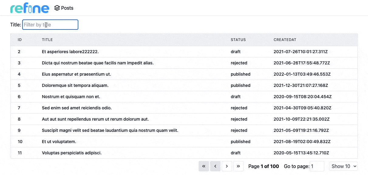
The @pankod/refine-react-table package also listens for changes in columnFilters and sorting states of the Tanstack Table and updates the table accordingly. The change in these states triggers the fetch of the new data.
So, we can add filters and sorting features to our table as suggested by TanStack Table with the following code:
import React from "react";
import { useTable, ColumnDef, flexRender } from "@pankod/refine-react-table";
import { useMany, GetManyResponse } from "@pankod/refine-core";

import {
    ChevronLeftIcon,
    ChevronRightIcon,
    ChevronsLeftIcon,
    ChevronsRightIcon,
} from "icons";

import { IPost, ICategory } from "interfaces";

export const PostList: React.FC = () => {
    const columns = React.useMemo<ColumnDef<IPost>[]>(
        () => [
            {
                id: "id",
                header: "ID",
                accessorKey: "id",
            },
            {
                id: "title",
                header: "Title",
                accessorKey: "title",
                meta: {
                    filterOperator: "contains",
                },
            },
            {
                id: "status",
                header: "Status",
                accessorKey: "status",
            },
            {
                id: "createdAt",
                header: "CreatedAt",
                accessorKey: "createdAt",
            },
            {
                id: "category.id",
                header: "Category",
                accessorKey: "category.id",
                cell: function render({ getValue, table }) {
                    const meta = table.options.meta as {
                        categoriesData: GetManyResponse<ICategory>;
                    };
                    const category = meta.categoriesData?.data.find(
                        (item) => item.id === getValue(),
                    );
                    return category?.title ?? "Loading...";
                },
            },
        ],
        [],
    );

    const {
        getColumn,
        getState,
        setPageIndex,
        getCanPreviousPage,
        getPageCount,
        getCanNextPage,
        nextPage,
        previousPage,
        setPageSize,
        getHeaderGroups,
        getRowModel,
        setOptions,
        refineCore: {
            tableQueryResult: { data: tableData },
        },
    } = useTable<IPost>({ columns });

    const categoryIds = tableData?.data?.map((item) => item.category.id) ?? [];
    const { data: categoriesData } = useMany<ICategory>({
        resource: "categories",
        ids: categoryIds,
        queryOptions: {
            enabled: categoryIds.length > 0,
        },
    });

    setOptions((prev) => ({
        ...prev,
        meta: {
            ...prev.meta,
            categoriesData,
        },
    }));

    const titleColumn = getColumn("title");

    return (
        <div className="container mx-auto pb-4">
            <div className="mb-3 mt-1 flex items-center justify-between">
                <div>
                    <label className="mr-1" htmlFor="title">
                        Title:
                    </label>
                    <input
                        id="title"
                        type="text"
                        className="rounded border border-gray-200 p-1 text-gray-700"
                        placeholder="Filter by title"
                        value={(titleColumn.getFilterValue() as string) ?? ""}
                        onChange={(event) =>
                            titleColumn.setFilterValue(event.target.value)
                        }
                    />
                </div>
            </div>
            <table className="min-w-full table-fixed divide-y divide-gray-200 border">
                <thead className="bg-gray-100">
                    {getHeaderGroups().map((headerGroup) => (
                        <tr key={headerGroup.id}>
                            {headerGroup.headers.map((header) => (
                                <th
                                    key={header.id}
                                    colSpan={header.colSpan}
                                    className="py-3 px-6 text-left text-xs font-medium uppercase tracking-wider text-gray-700 "
                                >
                                    <div
                                        onClick={header.column.getToggleSortingHandler()}
                                    >
                                        {flexRender(
                                            header.column.columnDef.header,
                                            header.getContext(),
                                        )}
                                        {{
                                            asc: " 🔼",
                                            desc: " 🔽",
                                        }[
                                            header.column.getIsSorted() as string
                                        ] ?? null}
                                    </div>
                                </th>
                            ))}
                        </tr>
                    ))}
                </thead>
                <tbody className="divide-y divide-gray-200 bg-white">
                    {getRowModel().rows.map((row) => {
                        return (
                            <tr
                                key={row.id}
                                className="transition hover:bg-gray-100"
                            >
                                {row.getVisibleCells().map((cell) => {
                                    return (
                                        <td
                                            key={cell.id}
                                            className="whitespace-nowrap py-2 px-6 text-sm font-medium text-gray-900"
                                        >
                                            {flexRender(
                                                cell.column.columnDef.cell,
                                                cell.getContext(),
                                            )}
                                        </td>
                                    );
                                })}
                            </tr>
                        );
                    })}
                </tbody>
            </table>
            <div className="mt-2 flex items-center justify-end gap-4">
                <div className="flex gap-1">
                    <button
                        onClick={() => setPageIndex(0)}
                        disabled={!getCanPreviousPage()}
                        className="flex items-center justify-between gap-1 rounded border border-gray-200 p-2 text-xs font-medium leading-tight transition duration-150 ease-in-out hover:bg-indigo-500 hover:text-white disabled:bg-gray-200 hover:disabled:text-black"
                    >
                        {ChevronsLeftIcon}
                    </button>
                    <button
                        onClick={() => previousPage()}
                        disabled={!getCanPreviousPage()}
                        className="flex items-center justify-between gap-1 rounded border border-gray-200 p-2 text-xs font-medium leading-tight transition duration-150 ease-in-out hover:bg-indigo-500 hover:text-white disabled:bg-gray-200 hover:disabled:text-black"
                    >
                        {ChevronLeftIcon}
                    </button>
                    <button
                        onClick={() => nextPage()}
                        disabled={!getCanNextPage()}
                        className="flex items-center justify-between gap-1 rounded border border-gray-200 p-2 text-xs font-medium leading-tight transition duration-150 ease-in-out hover:bg-indigo-500 hover:text-white disabled:bg-gray-200 hover:disabled:text-black"
                    >
                        {ChevronRightIcon}
                    </button>
                    <button
                        onClick={() => setPageIndex(getPageCount() - 1)}
                        disabled={!getCanNextPage()}
                        className="flex items-center justify-between gap-1 rounded border border-gray-200 p-2 text-xs font-medium leading-tight transition duration-150 ease-in-out hover:bg-indigo-500 hover:text-white disabled:bg-gray-200 hover:disabled:text-black"
                    >
                        {ChevronsRightIcon}
                    </button>
                </div>
                <span>
                    Page
                    <strong>
                        {getState().pagination.pageIndex + 1} of{" "}
                        {getPageCount()}
                    </strong>
                </span>
                <span>
                    Go to page:
                    <input
                        type="number"
                        defaultValue={getState().pagination.pageIndex + 1}
                        onChange={(e) => {
                            const page = e.target.value
                                ? Number(e.target.value) - 1
                                : 0;
                            setPageIndex(page);
                        }}
                        className="w-12 rounded border border-gray-200 p-1 text-gray-700"
                    />
                </span>
                <select
                    value={getState().pagination.pageSize}
                    onChange={(e) => {
                        setPageSize(Number(e.target.value));
                    }}
                    className="rounded border border-gray-200 p-1 text-gray-700"
                >
                    {[10, 20, 30, 40, 50].map((pageSize) => (
                        <option key={pageSize} value={pageSize}>
                            Show {pageSize}
                        </option>
                    ))}
                </select>
            </div>
        </div>
    );
};
Showing a single record
At this point we are able to list all post records on the table component. Next, we are going to add a details page to fetch and display data from a single record.
Before we start, just edit our interface for the new IPost type:
...

export interface IPost {
    id: number;
    title: string;
    status: "published" | "draft" | "rejected";
    createdAt: string;
    category: { id: number };
    content: string;
}
Let's create a <PostShow> component on /pages/posts folder:
import { useShow, useOne } from "@pankod/refine-core";

import { IPost, ICategory } from "interfaces";

export const PostShow: React.FC = () => {
    const { queryResult } = useShow<IPost>();
    const { data } = queryResult;
    const record = data?.data;

    const { data: categoryData } = useOne<ICategory>({
        resource: "categories",
        id: record?.category.id || "",
        queryOptions: {
            enabled: !!record,
        },
    });

    return (
        <div className="container mx-auto">
            <div className="mb-6">
                <label className="mb-2 block text-sm font-medium">Title</label>
                <input
                    value={record?.title}
                    disabled
                    className="block w-full rounded-lg border border-gray-300 bg-gray-50 p-2.5 text-sm"
                />
            </div>
            <div className="mb-6">
                <label className="mb-2 block text-sm font-medium">Status</label>
                <input
                    value={record?.status}
                    disabled
                    className="block w-full rounded-lg border border-gray-300 bg-gray-50 p-2.5 text-sm"
                />
            </div>
            <div className="mb-6">
                <label className="mb-2 block text-sm font-medium">
                    Category
                </label>
                <input
                    value={categoryData?.data.title}
                    disabled
                    className="block w-full rounded-lg border border-gray-300 bg-gray-50 p-2.5 text-sm"
                />
            </div>
            <div className="mb-6">
                <label className="mb-2 block text-sm font-medium">Status</label>
                <textarea
                    value={record?.content}
                    disabled
                    rows={10}
                    className="block w-full rounded-lg border border-gray-300 bg-gray-50 p-2.5 text-sm"
                />
            </div>
        </div>
    );
};
...

export * from "./show";
Now we can add the newly created component to our resource with show prop:
import { Refine } from "@pankod/refine-core";
import routerProvider from "@pankod/refine-react-router-v6";
import dataProvider from "@pankod/refine-simple-rest";

import { PostList, PostShow } from "./pages/posts";
import { Layout } from "components/Layout";
import { PostIcon } from "/icons";

export const App: React.FC = () => {
    return (
        <Refine
            routerProvider={routerProvider}
            dataProvider={dataProvider("https://api.fake-rest.refine.dev")}
            resources={[
                {
                    name: "posts",
                    icon: PostIcon,
                    list: PostList,
                    show: PostShow,
                },
            ]}
            Layout={Layout}
        />
    );
};
And then we can add a show button on the list page to make it possible for users to navigate to detail pages.
Just add the following highlighted lines to the existed list page:
...

import { useNavigation } from "@pankod/refine-core";

import {
    ...,
    ShowIcon
} from "icons";

export const PostList: React.FC = () => {
    const { show } = useNavigation();

    const columns = React.useMemo<ColumnDef<IPost>[]>(
        () => [
            ...
            {
                id: "action",
                header: "Action",
                accessorKey: "id",
                cell: function render({ getValue }) {
                    return (
                        <button
                            className="rounded border border-gray-200 p-2 text-xs font-medium leading-tight transition duration-150 ease-in-out hover:bg-indigo-500 hover:text-white"
                            onClick={() =>
                                show("posts", getValue() as number)
                            }
                        >
                            {ShowIcon}
                        </button>
                    )
                },
            },
        ],
        [],
    );

    const { ... } = useTable<IPost>({ columns });

    return (
        ...
    );
};
Show ShowIcon
export const ShowIcon = (
    <svg
        xmlns="http://www.w3.org/2000/svg"
        width="16"
        height="16"
        viewBox="0 0 24 24"
        fill="none"
        stroke="currentColor"
        strokeWidth="2"
        strokeLinecap="round"
        strokeLinejoin="round"
    >
        <path d="M1 12s4-8 11-8 11 8 11 8-4 8-11 8-11-8-11-8z"></path>
        <circle cx="12" cy="12" r="3"></circle>
    </svg>
);
✳️ useShow() is a refine hook used to fetch a single record of data. The queryResult has the response and also isLoading state.
Refer to the useShow documentation for detailed usage information. →
✳️ To retrieve the category title, again we need to make a call to /categories endpoint. This time we used useOne() hook to get a single record from another resource.
Refer to the useOne documentation for detailed usage information. →
useShow() is the preferred hook for fetching data from the current resource. To query foreign resources you may use the low-level useOne() hook.
Since we've got access to raw data returning from useShow(), there is no restriction on how it's displayed on your components.
Editing a record
First, we'll install @pankod/refine-react-hook-form package to use the useForm hook.
npm i @pankod/refine-react-hook-form
Until this point, we were basically working with reading operations such as fetching and displaying data from resources. From now on, we are going to start creating and updating records by using @pankod/refine-react-hook-form.
Refer to the @pankod/refine-react-hook-form documentation for detailed usage information. →
Let's start by creating a new <PostEdit> page responsible for editing a single record:
import { useEffect } from "react";
import { useForm } from "@pankod/refine-react-hook-form";
import { useSelect } from "@pankod/refine-core";

import { LoadingIcon } from "icons";

export const PostEdit: React.FC = () => {
    const {
        refineCore: { onFinish, formLoading, queryResult },
        register,
        handleSubmit,
        resetField,
        formState: { errors },
    } = useForm();

    const { options } = useSelect({
        resource: "categories",
        defaultValue: queryResult?.data?.data.category.id,
    });

    useEffect(() => {
        resetField("category.id");
    }, [options]);

    return (
        <div className="container mx-auto">
            <br />
            <form onSubmit={handleSubmit(onFinish)}>
                <div className="mb-6">
                    <label
                        htmlFor="title"
                        className="mb-2 block text-sm font-medium"
                    >
                        Title
                    </label>
                    <input
                        {...register("title", { required: true })}
                        type="text"
                        id="title"
                        className="block w-full rounded-lg border border-gray-300 bg-gray-50 p-2.5 text-sm "
                        placeholder="Title"
                    />
                    {errors.title && (
                        <p className="mt-1 text-sm text-red-600">
                            <span className="font-medium">Oops!</span> This
                            field is required
                        </p>
                    )}
                </div>
                <div className="mb-6">
                    <label
                        htmlFor="status"
                        className="mb-2 block text-sm font-medium"
                    >
                        Status
                    </label>
                    <select
                        {...register("status")}
                        className="block w-full rounded-lg border border-gray-300 bg-gray-50 p-2.5 text-sm"
                    >
                        <option value="published">published</option>
                        <option value="draft">draft</option>
                        <option value="rejected">rejected</option>
                    </select>
                </div>
                <div className="mb-6">
                    <label
                        htmlFor="category"
                        className="mb-2 block text-sm font-medium"
                    >
                        Category
                    </label>
                    <select
                        defaultValue={""}
                        {...register("category.id", { required: true })}
                        className="block w-full rounded-lg border border-gray-300 bg-gray-50 p-2.5 text-sm"
                    >
                        <option value={""} disabled>
                            Please select
                        </option>
                        {options?.map((category) => (
                            <option key={category.value} value={category.value}>
                                {category.label}
                            </option>
                        ))}
                    </select>
                    {errors.category && (
                        <p className="mt-1 text-sm text-red-600">
                            <span className="font-medium">Oops!</span> This
                            field is required
                        </p>
                    )}
                </div>
                <div className="mb-6">
                    <label
                        htmlFor="content"
                        className="mb-2 block text-sm font-medium"
                    >
                        Content
                    </label>
                    <textarea
                        {...register("content", { required: true })}
                        id="content"
                        className="block w-full rounded-lg border border-gray-300 bg-gray-50 p-2.5 text-sm "
                        placeholder="Content"
                        rows={10}
                    />
                    {errors.content && (
                        <p className="mt-1 text-sm text-red-600">
                            <span className="font-medium">Oops!</span> This
                            field is required
                        </p>
                    )}
                </div>
                <button
                    type="submit"
                    className="flex w-full items-center rounded-lg bg-indigo-500 px-5 py-2.5 text-center text-sm font-medium text-white hover:bg-indigo-600 sm:w-auto"
                >
                    {formLoading && LoadingIcon}
                    <span>Save</span>
                </button>
            </form>
        </div>
    );
};
...

export * from "./edit";
Show LoadingIcon
export const LoadingIcon = (
    <svg
        role="status"
        className="mr-2 h-4 w-4 animate-spin fill-blue-600 text-gray-200"
        viewBox="0 0 100 101"
        fill="none"
        xmlns="http://www.w3.org/2000/svg"
    >
        <path
            d="M100 50.5908C100 78.2051 77.6142 100.591 50 100.591C22.3858 100.591 0 78.2051 0 50.5908C0 22.9766 22.3858 0.59082 50 0.59082C77.6142 0.59082 100 22.9766 100 50.5908ZM9.08144 50.5908C9.08144 73.1895 27.4013 91.5094 50 91.5094C72.5987 91.5094 90.9186 73.1895 90.9186 50.5908C90.9186 27.9921 72.5987 9.67226 50 9.67226C27.4013 9.67226 9.08144 27.9921 9.08144 50.5908Z"
            fill="currentColor"
        />
        <path
            d="M93.9676 39.0409C96.393 38.4038 97.8624 35.9116 97.0079 33.5539C95.2932 28.8227 92.871 24.3692 89.8167 20.348C85.8452 15.1192 80.8826 10.7238 75.2124 7.41289C69.5422 4.10194 63.2754 1.94025 56.7698 1.05124C51.7666 0.367541 46.6976 0.446843 41.7345 1.27873C39.2613 1.69328 37.813 4.19778 38.4501 6.62326C39.0873 9.04874 41.5694 10.4717 44.0505 10.1071C47.8511 9.54855 51.7191 9.52689 55.5402 10.0491C60.8642 10.7766 65.9928 12.5457 70.6331 15.2552C75.2735 17.9648 79.3347 21.5619 82.5849 25.841C84.9175 28.9121 86.7997 32.2913 88.1811 35.8758C89.083 38.2158 91.5421 39.6781 93.9676 39.0409Z"
            fill="currentFill"
        />
    </svg>
);
Now we can add the newly created component to our resource with edit prop:
import { Refine } from "@pankod/refine-core";
import routerProvider from "@pankod/refine-react-router-v6";
import dataProvider from "@pankod/refine-simple-rest";

import { PostList, PostShow, PostEdit } from "./pages/posts";
import { Layout } from "components/Layout";
import { PostIcon } from "/icons";

export const App: React.FC = () => {
    return (
        <Refine
            routerProvider={routerProvider}
            dataProvider={dataProvider("https://api.fake-rest.refine.dev")}
            resources={[
                {
                    name: "posts",
                    icon: PostIcon,
                    list: PostList,
                    show: PostShow,
                    edit: PostEdit,
                },
            ]}
            Layout={Layout}
        />
    );
};
We are going to need an edit button on each row to display the <PostEdit> component. refine doesn't automatically add one, so we have to update our <PostList> component to add a edit button for each record by using highlighted lines:
...

import { useNavigation } from "@pankod/refine-core";

import {
    ...
    ShowIcon,
    EditIcon
} from "icons";

export const PostList: React.FC = () => {
    const { show, edit } = useNavigation();

    const columns = React.useMemo<ColumnDef<IPost>[]>(
        () => [
            ...
            {
                id: "action",
                header: "Action",
                accessorKey: "id",
                cell: function render({ getValue }) {
                    return (
                        <div className="flex gap-2">
                            <button
                                className="rounded border border-gray-200 p-2 text-xs font-medium leading-tight transition duration-150 ease-in-out hover:bg-indigo-500 hover:text-white"
                                onClick={() =>
                                    edit("posts", getValue() as number)
                                }
                            >
                                {EditIcon}
                            </button>
                            <button
                                className="rounded border border-gray-200 p-2 text-xs font-medium leading-tight transition duration-150 ease-in-out hover:bg-indigo-500 hover:text-white"
                                onClick={() =>
                                    show("posts", getValue() as number)
                                }
                            >
                                {ShowIcon}
                            </button>
                        </div>
                    ),
                }
            },
        ],
        [],
    );

    const { ... } = useTable<IPost>({ columns });

    return (
        ...
    );
};
Show EditIcon
export const EditIcon = (
    <svg
        xmlns="http://www.w3.org/2000/svg"
        width="16"
        height="16"
        viewBox="0 0 24 24"
        fill="none"
        stroke="currentColor"
        strokeWidth="2"
        strokeLinecap="round"
        strokeLinejoin="round"
    >
        <path d="M12 20h9"></path>
        <path d="M16.5 3.5a2.121 2.121 0 0 1 3 3L7 19l-4 1 1-4L16.5 3.5z"></path>
    </svg>
);
Creating a record
Creating a record in refine follows a similar flow as editing records.
First, we'll create a <PostCreate> page:
import { useForm } from "@pankod/refine-react-hook-form";
import { useSelect } from "@pankod/refine-core";

import { LoadingIcon } from "icons";

export const PostCreate: React.FC = () => {
    const {
        refineCore: { onFinish, formLoading },
        register,
        handleSubmit,
        formState: { errors },
    } = useForm();

    const { options } = useSelect({
        resource: "categories",
    });

    return (
        <div className="container mx-auto">
            <br />
            <form onSubmit={handleSubmit(onFinish)}>
                <div className="mb-6">
                    <label
                        htmlFor="title"
                        className="mb-2 block text-sm font-medium"
                    >
                        Title
                    </label>
                    <input
                        {...register("title", { required: true })}
                        type="text"
                        id="title"
                        className="block w-full rounded-lg border border-gray-300 bg-gray-50 p-2.5 text-sm "
                        placeholder="Title"
                    />
                    {errors.title && (
                        <p className="mt-1 text-sm text-red-600">
                            <span className="font-medium">Oops!</span> This
                            field is required
                        </p>
                    )}
                </div>
                <div className="mb-6">
                    <label
                        htmlFor="status"
                        className="mb-2 block text-sm font-medium"
                    >
                        Status
                    </label>
                    <select
                        {...register("status")}
                        className="block w-full rounded-lg border border-gray-300 bg-gray-50 p-2.5 text-sm"
                    >
                        <option value="published">published</option>
                        <option value="draft">draft</option>
                        <option value="rejected">rejected</option>
                    </select>
                </div>
                <div className="mb-6">
                    <label
                        htmlFor="category"
                        className="mb-2 block text-sm font-medium"
                    >
                        Category
                    </label>
                    <select
                        defaultValue={""}
                        {...register("category.id", { required: true })}
                        className="block w-full rounded-lg border border-gray-300 bg-gray-50 p-2.5 text-sm"
                    >
                        <option value={""} disabled>
                            Please select
                        </option>
                        {options?.map((category) => (
                            <option key={category.value} value={category.value}>
                                {category.label}
                            </option>
                        ))}
                    </select>
                    {errors.category && (
                        <p className="mt-1 text-sm text-red-600">
                            <span className="font-medium">Oops!</span> This
                            field is required
                        </p>
                    )}
                </div>
                <div className="mb-6">
                    <label
                        htmlFor="content"
                        className="mb-2 block text-sm font-medium"
                    >
                        Content
                    </label>
                    <textarea
                        {...register("content", { required: true })}
                        id="content"
                        className="block w-full rounded-lg border border-gray-300 bg-gray-50 p-2.5 text-sm "
                        placeholder="Content"
                        rows={10}
                    />
                    {errors.content && (
                        <p className="mt-1 text-sm text-red-600">
                            <span className="font-medium">Oops!</span> This
                            field is required
                        </p>
                    )}
                </div>
                <button
                    type="submit"
                    className="flex w-full items-center rounded-lg bg-indigo-500 px-5 py-2.5 text-center text-sm font-medium text-white hover:bg-indigo-600 sm:w-auto"
                >
                    {formLoading && LoadingIcon}
                    <span>Save</span>
                </button>
            </form>
        </div>
    );
};
...

export * from "./create";
After creating the <PostCreate> component, add it to resource with create prop:
import { Refine } from "@pankod/refine-core";
import routerProvider from "@pankod/refine-react-router-v6";
import dataProvider from "@pankod/refine-simple-rest";

import { PostList, PostShow, PostEdit, PostCreate } from "./pages/posts";
import { Layout } from "components/Layout";
import { PostIcon } from "/icons";

export const App: React.FC = () => {
    return (
        <Refine
            routerProvider={routerProvider}
            dataProvider={dataProvider("https://api.fake-rest.refine.dev")}
            resources={[
                {
                    name: "posts",
                    icon: PostIcon,
                    list: PostList,
                    show: PostShow,
                    edit: PostEdit,
                    create: PostCreate,
                },
            ]}
            Layout={Layout}
        />
    );
};
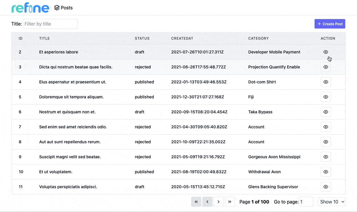
Finally, We are going to need an create button on top of the right side of the PostList page to create new posts. It redirects to create page.
...

import { useNavigation } from "@pankod/refine-core";

import {
    ...,
    CreateIcon
} from "icons";

export const PostList: React.FC = () => {
    const {
        ...,
        create
        } = useNavigation();

    const columns = React.useMemo<ColumnDef<IPost>[]>(...)

    const {...} = useTable<IPost>({ columns });

    return (
        <div className="container mx-auto pb-4">
            <div className="mb-3 mt-1 flex items-center justify-between">
                <div>
                    ...
                </div>
                <button
                    className="flex items-center justify-between gap-1 rounded border border-gray-200 bg-indigo-500 p-2 text-xs font-medium leading-tight text-white transition duration-150 ease-in-out hover:bg-indigo-600"
                    onClick={() => create("posts")}
                >
                    {CreateIcon}
                    <span>Create Post</span>
                </button>
            </div>

            ...

        </div>
    );
};
Show CreateIcon
export const CreateIcon = (
    <svg
        xmlns="http://www.w3.org/2000/svg"
        width="16"
        height="16"
        viewBox="0 0 24 24"
        fill="none"
        stroke="currentColor"
        strokeWidth="2"
        strokeLinecap="round"
        strokeLinejoin="round"
    >
        <line x1="12" y1="5" x2="12" y2="19"></line>
        <line x1="5" y1="12" x2="19" y2="12"></line>
    </svg>
);
And that's it! Try it on the browser and see if you can create new posts from scratch.
We should notice some minor differences from the edit example:
✳️ No defaultValue is passed to useSelect.
✳️ resetField in not necessary, because we don't have any default values.
Deleting a record
Deleting a record can be done with useDelete hook.
Refer to the useDelete documentation for detailed usage information. →
We are adding an delete button on each row since refine doesn't automatically add one, so we have to update our <PostList> component to add a delete button for each record. Add the following highlighted lines to the existing list component.
...

import { useNavigation, useDelete } from "@pankod/refine-core";

import {
...,
DeleteIcon
} from "icons";

export const PostList: React.FC = () => {
    const { show, edit } = useNavigation();

    const { mutate } = useDelete();

    const columns = React.useMemo<ColumnDef<IPost>[]>(
        () => [
            ...
            {
                id: "action",
                header: "Action",
                accessorKey: "id",
                cell: function render({ getValue }) {
                    return (
                        <div className="flex gap-2">
                        ...

                            <button
                                className="rounded border border-gray-200 p-2 text-xs font-medium leading-tight transition duration-150 ease-in-out hover:bg-red-500 hover:text-white"
                                onClick={() =>
                                    mutate({
                                        id: getValue() as number,
                                        resource: "posts",
                                    })
                                }
                            >
                                {DeleteIcon}
                            </button>
                        </div>
                    ),
                }
            },
        ],
        [],
    );

    const { ... } = useTable({ columns });

    return (
        ...
    );
};
Show DeleteIcon
export const DeleteIcon = (
    <svg
        xmlns="http://www.w3.org/2000/svg"
        width="16"
        height="16"
        viewBox="0 0 24 24"
        fill="none"
        stroke="currentColor"
        strokeWidth="2"
        strokeLinecap="round"
        strokeLinejoin="round"
    >
        <polyline points="3 6 5 6 21 6"></polyline>
        <path d="M19 6v14a2 2 0 0 1-2 2H7a2 2 0 0 1-2-2V6m3 0V4a2 2 0 0 1 2-2h4a2 2 0 0 1 2 2v2"></path>
        <line x1="10" y1="11" x2="10" y2="17"></line>
        <line x1="14" y1="11" x2="14" y2="17"></line>
    </svg>
);
Now you can try deleting records yourself. Just click on the delete button of the record you want to delete.
Live StackBlitz Example
Our tutorial is complete. Below you'll find a Live StackBlitz Example displaying what we have done so far: